The power of colour: Why contrast matters as we age
June 19, 2026
For a long time, we’ve been surrounded by beautiful interiors layered in whites, greys and soft muted tones. It became the look: clean, calm, understated and ready for resale.
But here’s the part we didn’t fully think through.
As we age, those same spaces can become harder to navigate, harder to read, and in some cases, less safe.
This isn’t about style. It’s about how our bodies change and how design either supports us or quietly works against us.
Colour, light and contrast
Most of us notice changes in our vision over time. We need more light, and colours don’t feel as crisp as they use to. Reading small print becomes more difficult. What’s less obvious is how much we lose our ability to see contrast.
The lens of our eyes gradually yellows, our pupils becomes smaller and less light reaches the retina. By the time we reach our 70s or 80s, we may need two to three times more light to see as clearly as we once did. But even more important than light is contrast.
Contrast is what allows us to distinguish one surface from another. It’s how we see the edge of a step, the outline of a countertop or where a wall ends and a floor begins. Without it, everything starts to blend.
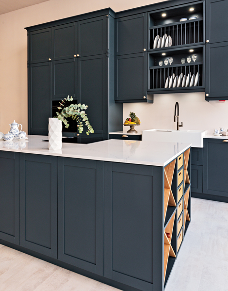
A pale grey floor against a slightly darker grey cabinet may look elegant, but it can be difficult to read. Edges disappear and depth becomes harder to judge. Our brain must work harder just to understand what it’s seeing. That extra effort matters. When the brain is working overtime to interpret the environment, it can increase fatigue, frustration and even anxiety. In practical terms, it can also increase the risk of trips and falls.
Easier navigation
Research has shown that adding clear visual contrast to stair edges can improve safety, with recommendations suggesting a least a 50-per-cent difference between surfaces to help older adults move more confidently.
You don’t need to understand technical measurements to get this right. A simple rule is this: Important things should not blend into the background. If your floors, walls, fixtures, cabinets, counters and light switches are all similar in tone, your eyes must work harder to find them.
A good test is to take a photo of the room and turn it into a black and white image. If everything looks like one soft grey blur, there probably isn’t enough contrast. If you can clearly see where one surface ends and another begins, the space will be easier to navigate.
Interestingly, many paint chips already hold part of the answer. On the back, you’ll often find something called an LRV number (Light Reflectance Value). You don’t need to understand the science behind it, but it does tell you how light or dark a colour is. What matters is the difference between two colours. If they are too close, they blend. If they are further apart, your eye can read the space more easily.
This is where your local paint store can be surprisingly helpful. If you simply tell them you want to create enough contrast for aging eyes, they can guide you toward combinations that are not just beautiful, but supportive.
Brighter and more vibrant
This is also where we need to rethink how we use colour. It’s not about making spaces look brighter or more vibrant. It’s about using colour with purpose. Contrast can be created in simple ways. A darker countertop against lighter cabinetry can make a kitchen easier to use. A white toilet that contrasts with the floor or wall behind it can make the bathroom safer and easier to navigate. A stair edge that is clearly defined can help someone feel more confident moving between levels. Hardware that stands out from cabinets, or a switch plate that is visible at a glance, can reduce frustration in everyday routines.
And yes, colour also affects how we feel. As we age, many people prefer softer, more comfortable tones. That makes sense. But when everything becomes too similar, we lose visual cues our brain depends on. Colour needs contrast to do its job.
If someone is living with dementia or other cognitive challenges, contrast becomes even more important. The brain may already be working harder to process information. When the environment lacks clarity, it can add confusion. Something as simple as a toilet seat that contrasts the toilet or a doorway that is clearly defined from the wall, can support independence and reduce stress. In these situations, colour isn’t just helpful, it becomes essential.
The trend of all-grey and all-white interiors gave us a certain aesthetic. But it didn’t take the aging body into account. What looks calm and minimal at 40 can feel indistinct at 75. And this is where we need to shift the conversation. Good design isn’t just about how a space looks when it’s finished. It’s about how it supports you over time.
We often talk about colour as something that makes a space beautiful, but as we age, colour becomes something that helps us live safely, confidently and independently. It helps us understand where we are, where we are going, and how to move through our environment with ease.
Colour is not just decoration. When used with intention, it supports how we live.
About Author
Linda Kafka
Linda Kafka, Wellness and Aging in Place Educator, writes about wellness, aging in place and how our homes support well-being at every stage of life. livablecanada.com.